BCB
Group.
What they do,
made clear. One brand system.
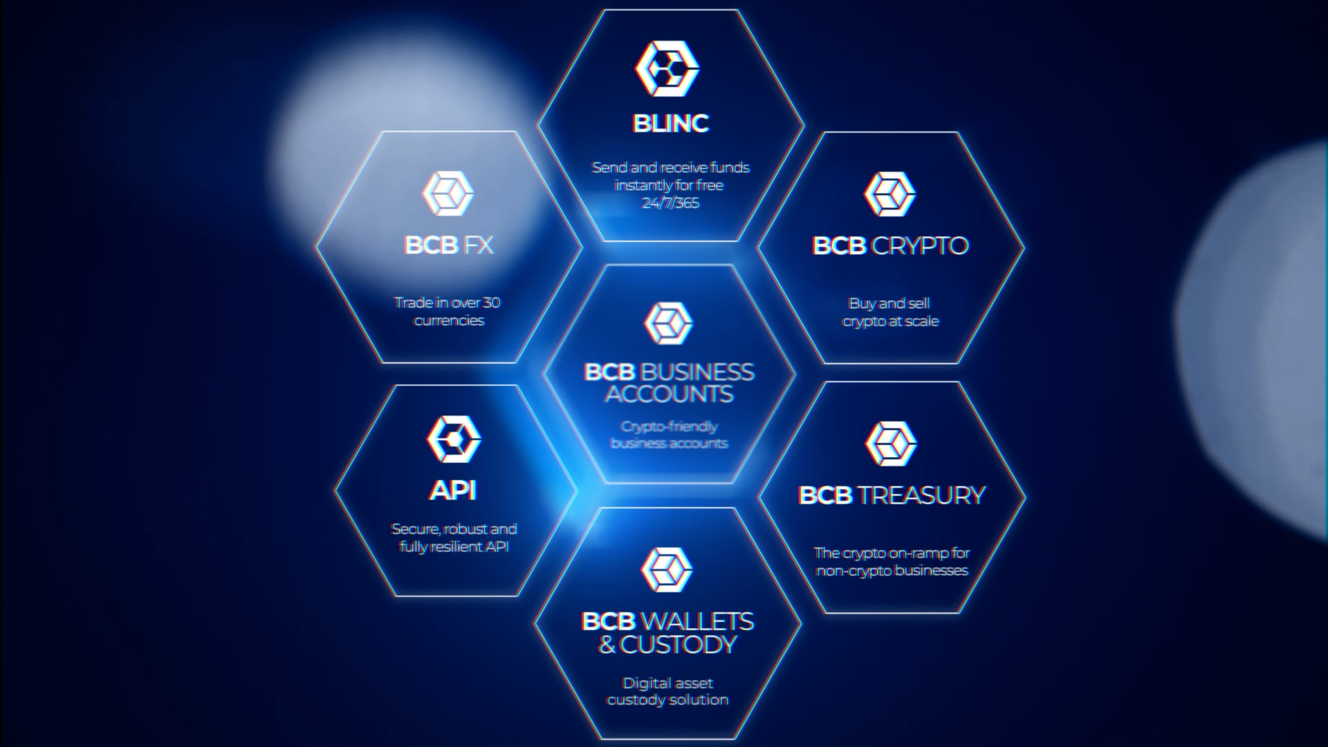
BCB Group sits where banking meets digital assets, with a product suite most people have never had to picture before. The brief was a single “What We Do” film that could make that whole world legible in under a minute — so the work leans on motion rather than footage. Kinetic typography carries the vision and the mission, building each line word by word — empower the global financial revolution, connect and bank the global crypto industry — all in the brand's own electric blue. From there the film resolves into a system: a hexagon, the BCB mark, becomes the organising shape for the whole suite.
Business Accounts, BLINC instant settlement, FX, Crypto, Treasury, Wallets & Custody and the API all snap into one honeycomb, each on its own backdrop of light beams and fibre-optic streaks, so a complex business reads as a single, confident brand. This one was a collaboration: Rod Minter Brown, then Executive Creative Director at BCB, led the look and feel and handled the final music and sound mix, while I took on the animation, transitions and a share of the concept, working to his creative direction. It's a good example of how I fit into someone else's vision rather than imposing my own — taking a defined brief and an established look and delivering the motion that holds it together.
One brand,
in motion.
One system,
seven products.
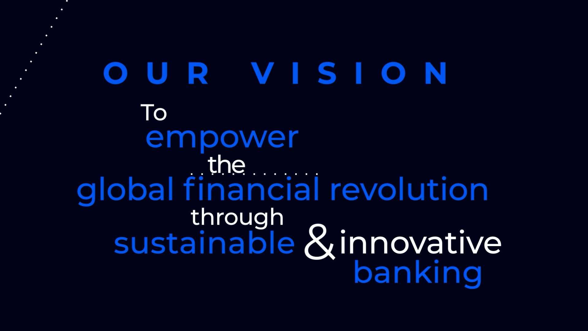
Empower the revolution
The vision built word by word — “empower the global financial revolution through sustainable and innovative banking” — typeset in motion as the film's opening statement of intent.
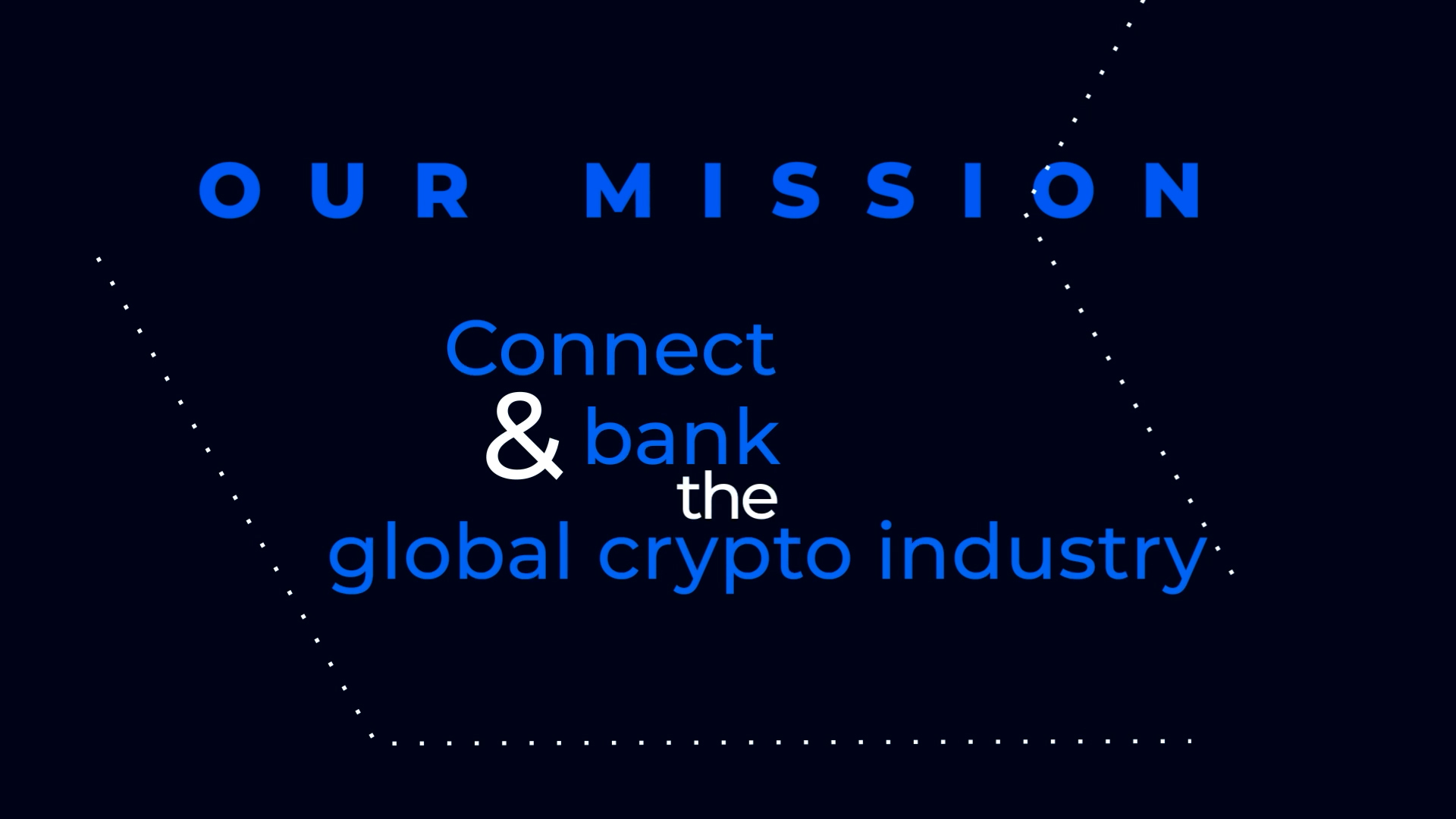
Connect & bank crypto
The mission as a second typographic beat — connect and bank the global crypto industry — the same type system carrying a different idea, keeping the film's voice consistent.
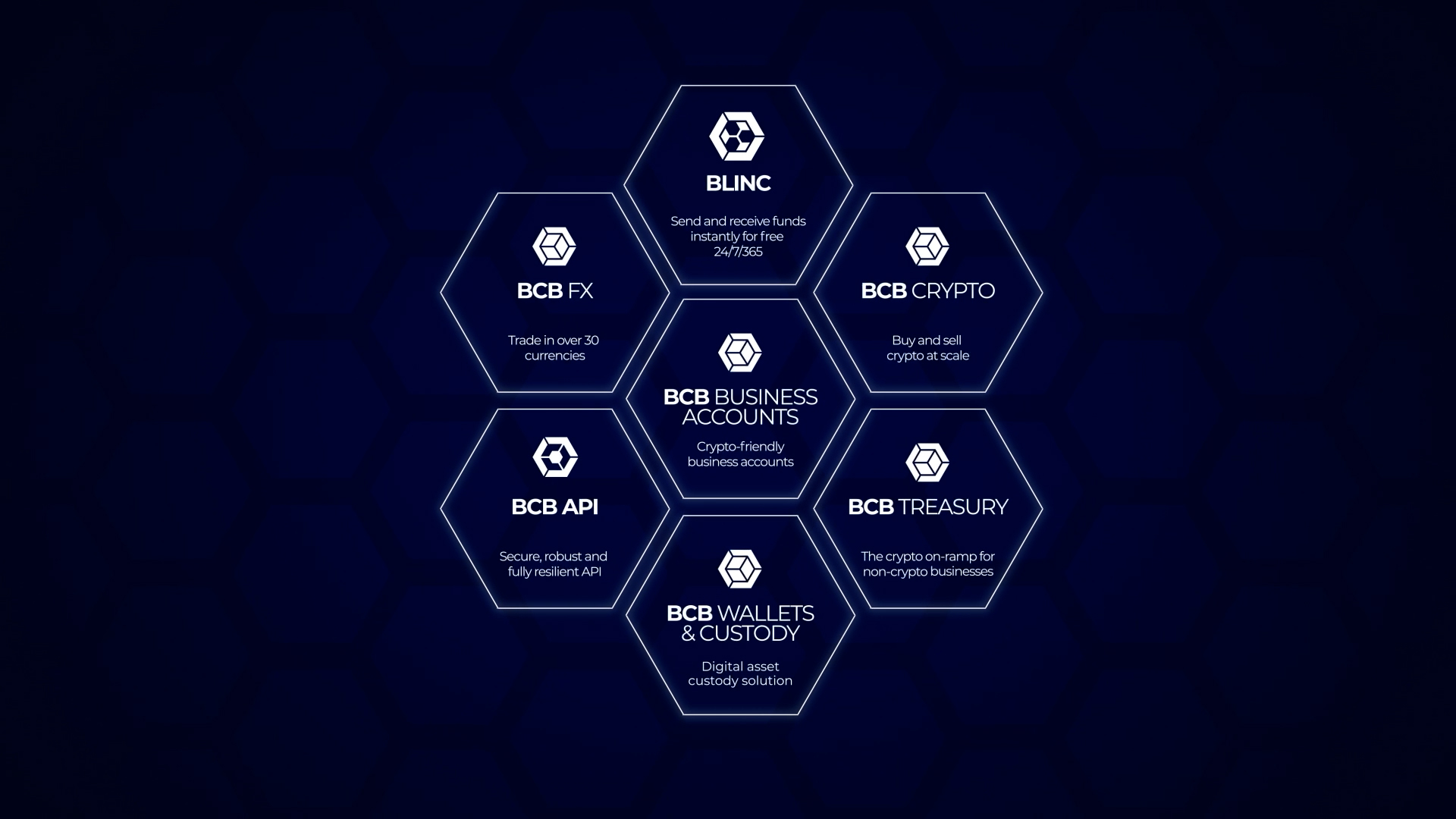
One hexagon, seven products
The whole suite snapped into a single honeycomb — Business Accounts, BLINC, FX, Crypto, Treasury, Wallets & Custody and the API — the brand mark turned into an organising system.
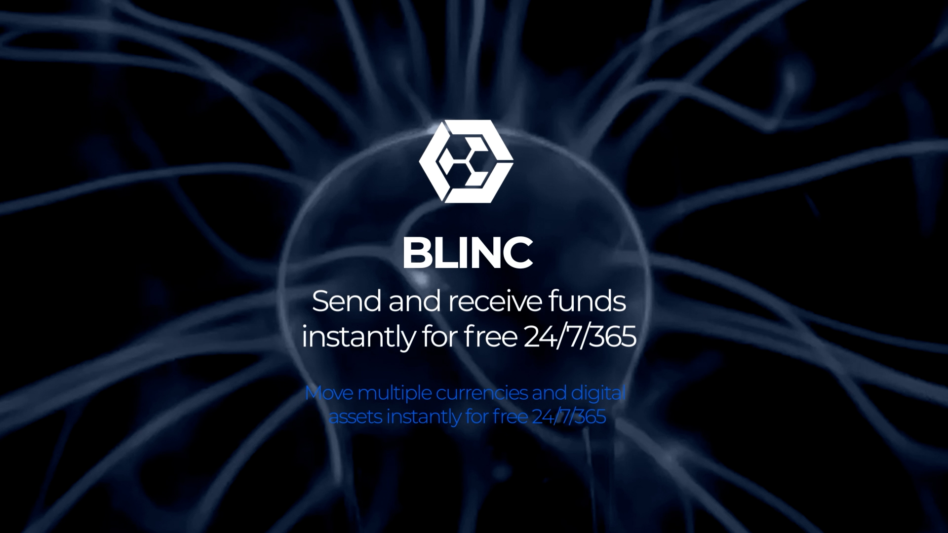
Funds, instantly
BLINC — send and receive funds instantly, around the clock — set against a fibre-optic swirl that turns a payments rail into something you can feel move.
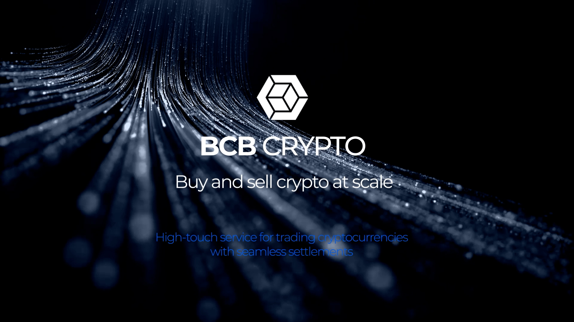
Crypto at scale
BCB Crypto — buy and sell at scale — streaks of blue light driving the pace, each product chapter given its own atmospheric backdrop within one colour world.
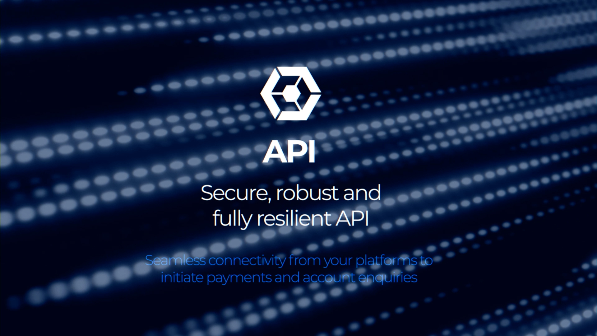
Secure, resilient API
The API chapter — secure, robust and fully resilient — rendered as a stream of data, the infrastructure layer that quietly underpins everything above it.